
Delicius 大阪店
Delicius Osaka
Cake shop
Osaka, Japan / 2012.02
25.5m2
 |  |  |
|---|---|---|
 |
「Delicius(デリチュース)大阪店」は、JR大阪駅1F中央改札口前エリアにあるケーキ店で、箕面本店Labで作られたケーキを販売するスペースです。床面積は約7坪、販売スペースとバックヤードのみで構成されます。
このエリアは、主要交通の拠点であり、買物客や通勤・通学などあらゆる方々が往来されます。
そこで、約7坪という狭い空間を活かし、ブランドコンセプトを素直に強く表現することを目的としました。
オーナーは、リンゴのお菓子を得意とされており、店名やロゴマークにも「リンゴ」を使用されています。
箕面本店の壁面には、「3本のリンゴの木(3本=店舗数を示す)」がオーナー直筆で描かれていました。そこには、「心を込めてお店を育て、一歩一歩確実に進んで行きたい。リンゴの木と共に成長していきたい。」という願いが込められています。
意匠については、長方形の区画に対して、ブランドコンセプトが詰まった「ケーキ箱」をイメージし、壁面3面とショーケース前には抽象的なリンゴの木を配しました。また、「おいしいに想いをこめて」とおっしゃるオーナーの真心が、お客様に降り注ぐようなイメージで、アイキャッチにリンゴのロゴマークを吊りました。
昔から「デリチュース」を愛して下さるお客様に対しても、違和感のない暖かい「ケーキ箱」がご提案できたと思います。
Located in front area of central gate of JR Osaka station, Delicius Osaka branch was designed with full of its brand concept and owner’s wish. We took advantage of the small space with only 25 sq.m. to represent the brand simply but strongly.
The owner is especially good at apple cakes, and he use “Apple” for the name and logo as a symbol of his shop. He also draw “three apple trees” on the wall of its main shop in Minou (northern area in Osaka) by himself, wishing grow the shop altogether with the trees step by step, wholeheartedly.
Based on the meaning of “Apple” for this brand, we designed the Osaka shop looks as a cake box fully packed with “Delicius”; set abstract apple trees on the back and front walls, hanged eye-catching apples which is logo design of the brand from the ceiling to express radiation of the owner’s whole heart that provides perfect cakes for customers.
Media
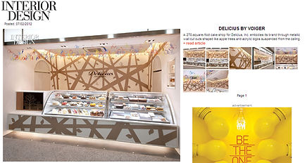
INTERIOR DESIGN / 2012.7

retail design blog / 2014.5